 2011年 8月 19日に公開された Bootstrap は 2015年 8月 19日で 4回目の誕生日を迎えたそうですが、この記念日に Bootstrap 4 のアルファ版が最初のリリースをされました。公式 Blog にて紹介されています。
Today is a special day for Bootstrap. Not only is it our fourth birthday, but after a year of development, we're finally shipping the first alpha release of Bootstrap 4. Hell yeah!
テンション高い。
ちなみに、Blog 記事によると大まかな変更点は下記のような感じらしいです。
There are a ton of major changes to Bootstrap and it's impossible to cover them all in detail here, so here are some of our favorite highlights:
- Moved from Less to Sass. Bootstrap now compiles faster than ever thanks to Libsass, and we join an increasingly large community of Sass developers.
- Improved grid system. We've added a new grid tier to better target mobile devices and completely overhauled our semantic mixins.
- Opt-in flexbox support is here. The future is now--switch a boolean variable and recompile your CSS to take advantage of a flexbox-based grid system and components.
- Dropped wells, thumbnails, and panels for cards. Cards are a brand new component to Bootstrap, but they'll feel super familiar as they do nearly everything wells, thumbnails, and panels did, only better.
- Consolidated all our HTML resets into a new module, Reboot. Reboot steps in where Normalize.css stops, giving you more opinionated resets like
box-sizing: border-box, margin tweaks, and more all in a single Sass file.- Brand new customization options. Instead of relegating style embellishments like gradients, transitions, shadows, and more to a separate stylesheet like v3, we've moved all those options into Sass variables. Want default transitions on everything or to disable rounded corners? Simply update a variable and recompile.
- Dropped IE8 support and moved to rem and em units. Dropping support for IE8 means we can take advantage of the best parts of CSS without being held back with CSS hacks or fallbacks. Pixels have been swapped for rems and ems where appropriate to make responsive typography and component sizing even easier. If you need IE8 support, keep using Bootstrap 3.
- Rewrote all our JavaScript plugins. Every plugin has been rewritten in ES6 to take advantage of the newest JavaScript enhancements. They also now come with UMD support, generic teardown methods, option type checking, and tons more.
- Improved auto-placement of tooltips and popovers thanks to the help of a tool called Tether.
- Improved documentation. We rewrote it all in Markdown and added a few handy plugins to streamline examples and code snippets to make working with our docs way easier. Improved search is also on it's way.
- And tons more! Custom form controls, margin and padding classes, new utility classes, and more have also been included.
And that barely scratches the surface of the 1,100 commits and 120,000 lines of changes in v4 so far. Plus, we're not even done yet!
例えば、
- Less から Sass に切り替えたよ
- グリッドシステムを更新したよ
- オプトインが必要ということでデフォルトでは無効ですが、Flexbox に対応したグリッドレイアウトが可能になったよ (ちなみに Flexbox については 2年前の記事ですが下記に詳しく書いています。参考まで)
- IE8 のサポートやめたよ (元々 Bootstrap 3.0 系 でもサポート切られてたと思うけど、公式ドキュメント内の 「Internet Explorer 8 and 9」 セクションに一応対応方法が案内されています)
などなど。
Flexbox の参考記事 : CSS Flexible Box (Flexbox) を使ってみよう - 最新仕様対応版
IE8 に加えて iOS 6 のサポートも終了
ブラウザサポートについては、v4 の公式ドキュメントにもう少し詳しく書かれています。
Browser support
- Dropped IE8 and iOS 6 support. v4 is now only IE9+ and iOS 7+. For sites needing either of those, use v3.
- Added official support for Android v5.0 Lollipop's Browser and WebView. Earlier versions of the Android Browser and WebView remain only unofficially supported.
Browser support : Migrating to v4 / Bootstrap 4 Documentation から引用
公式テーマの販売サイトもリリース
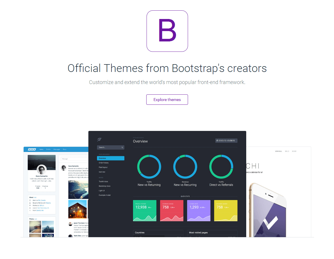
まだ 3つのテーマ (Bootstrap 3 で構築) しか公開されていませんが、公式テーマの購入、ダウンロードが可能なサイトも立ち上がったそうです。